|
this is my 6x3 hand and wheel. I let my hands dry so that they would grab onto the clay and twist it like this. I then cut holes into it to make it and hand project, I glazed it shadow green. My design element was form and my art element was contrast cause the two colors contrasted eachother.
0 Comments
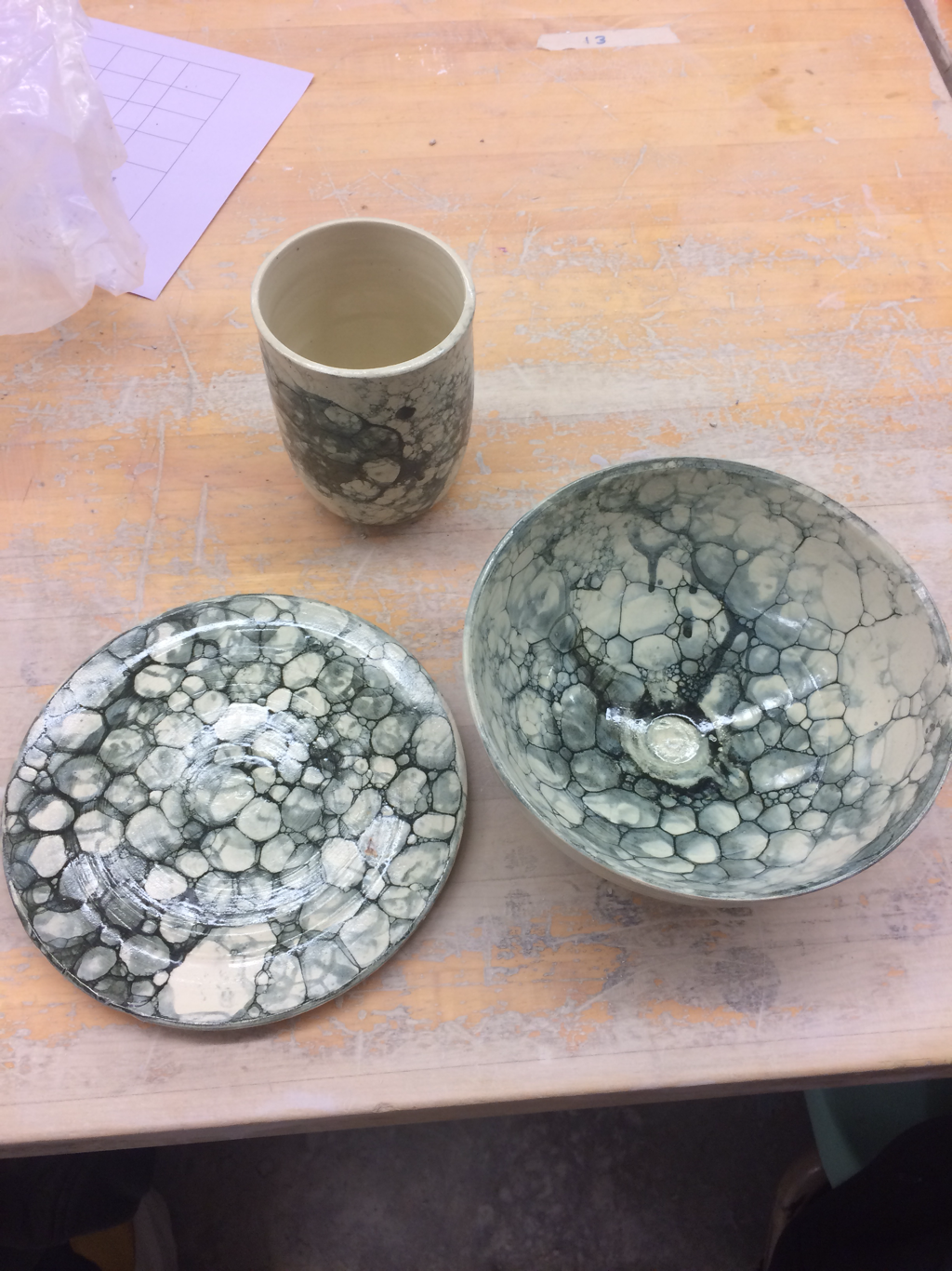 this is my set of three that I bubble glazed with black glaze, this was my first time bubble glazing so I'm really happy with how it turned out. If I do ceramics next year I definitely want to experiment more with this kind of glazing. I used the art element of contrast to show the bubble design and I used the design element of form to show how they are all formed well, this project shows how far I've come with my glazing techniques.
this is my 14x7 inch tall project, I glazed it with forest cobalt and white. It didn't turn out how I wanted to but that's okay at least it didn't look totally terrible. I used the art element value to show the shoulders of the vase. I used the design element of space because there is a lot of empty space in the pot. This pot represents how far I've come In my ceramics.
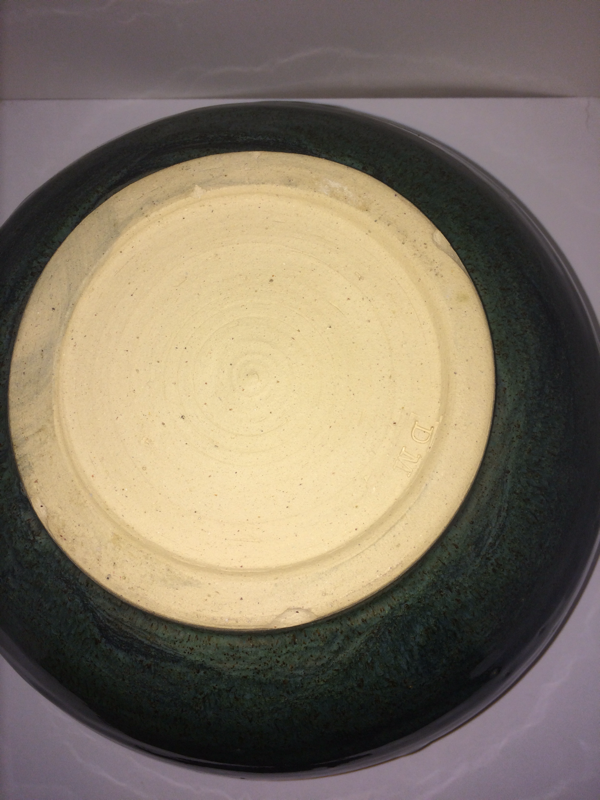
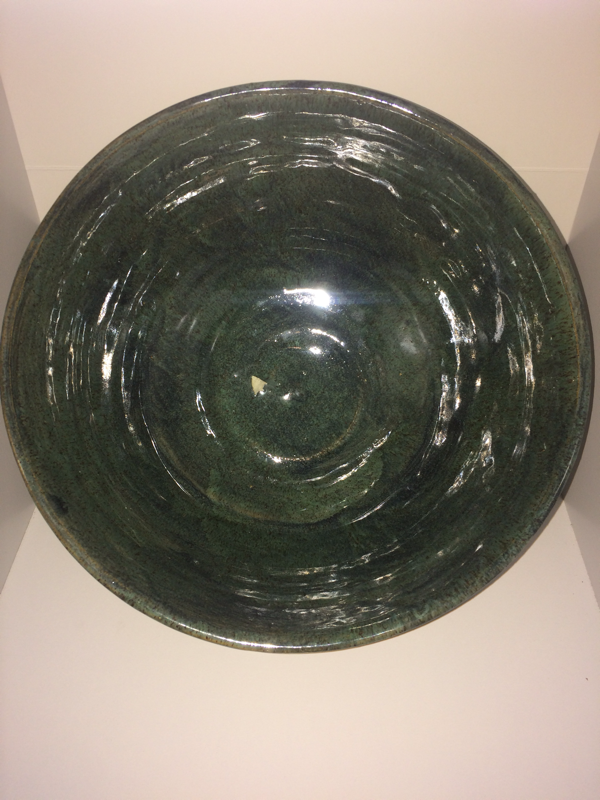
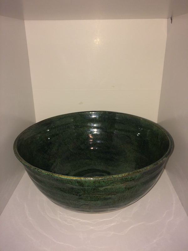
this is my 8x5 large bowl, I glazed it with sydneys blue and dark cobalt. The art element I used was line because I put the streaks of darker blue down the sides. My design element was unity because they whole project went together really well. This was one of my least favorite projects cause the glazed were really translucent. this is my 12 x 2 frankenpot that i glazed with shadow green and forest cobalt. i used the art element of line and value. i used the design element of contrast with the light streaks running down the side with the dark. this project showed my skill of using glazes and connecting small pots together this is my 10 by 8 inch bowl. I glazed it with shadow green and dark cobalt, I really like how the glaze turned out and the footing was really nice too. The art element used was unity and the design element used was harmony. This is one of my favorite projects so far and I hope to make more like it.
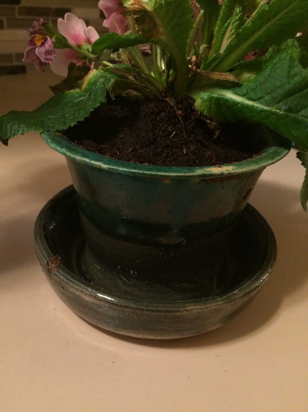 this is my 4x4 inch planter. I glazed it with shadow green and matte turquoise. For this project I learned how to pull a double wall projects which really expanded my variety of pots I can make. My art element used was color and my design element was harmony because the two greens really went well together.
this is my 2x4 pitcher with a pulled handle. I glazed it dark blue but it didn't turn out very well and there were patches that crawled on the inside. My art element used was value because the white foot really pops with the dark glaze. My design element was contrast because the contrast of the spaces that crawled draw attention to them which isn't necessarily a good thing.
this is my 2x6 vase that I used as extra credit. I put a coat of white over the whole thing and then ran shadow green down the side. the bottom of my pot is very thick which makes the pot heavy but that is okay its just for decoration. my art element used was line because the lines of glaze running down draw your attention to the bottom of the pot. my design elemnt used was harmony because the green and white really go together.
|
AuthorWrite something about yourself. No need to be fancy, just an overview. Archives
June 2017
Categories |
 RSS Feed
